Fujifilm X-Pro3 Development Story: Classic Negative Film Simulation – Learning from Film

Classic Negative
Fujifilm has just published their Classic Negative Film Simulation development story. You can read it all down below.
We remind you that FujiRumors already told you Fujifilm will update these older Fujifilm cameras with Classic Negative film simulation, too. Also, already now, Capture One Pro 12 offers Classic Negative film simulation profile.
JOIN: Fujifilm X Pro User Group
Fujifilm X-Pro3: BHphoto, AmazonUS, Adorama, FocusCamera
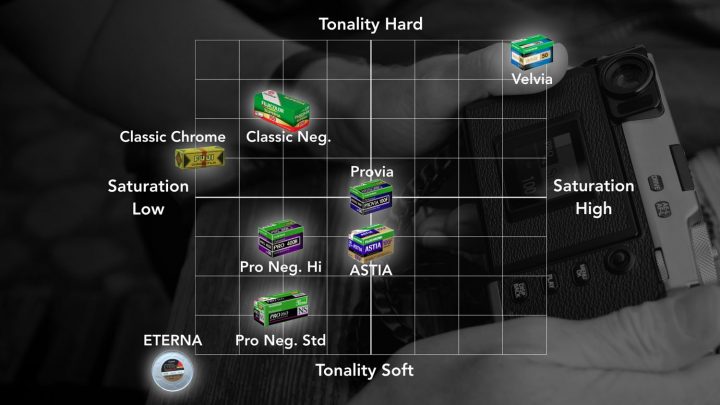
“CLASSIC Neg.”, the third negative film simulation, is modeled on SUPERIA film. Although we already have two other negative film simulations, those were designed with a particular process in mind—specifically, for taking photos under professional lighting. It sounds bad to say that SUPERIA is for amateurs, but I certainly don’t mean that it’s amateur-quality film, but rather that it’s designed for use in settings that are not professionally lit.
While the two “Pro Neg.” options are distinguished by their gentle tone gradations that can fully capture subtle lighting effects, “CLASSIC Neg.” is designed for slightly higher contrast in order to add depth to scenes with flat lighting. Like all negative films, however, it lacks saturation, offering less than the standard “PROVIA” option. In this respect, there is little to distinguish it from the two “Pro Neg.” simulations.
There is, however, more to the story. The most notable aspect of “CLASSIC Neg.” is a design that features tones customized by brightness for each color. Although the term may seem unfamiliar to some ears, at Fujifilm they are calling this “color (or color-by-color) contrast”.
[…]we adjust tone curves to tighten shadows and blow out highlights. Carefully choosing the details we want visible and those we don’t brings our photographs to life. What would it be like, then, if Fujifilm were to do that work for us on a color-by-color basis? That just what the new “CLASSIC Neg.” film simulation does. With one color the relationship between input and output is linear, while with another output for inputs below a certain threshold brightness are reduced (which more or less means that the color will not appear as clearly in the output). Keeping output lower than the input brightness would suggest gives pictures a veiled feel that heightens the contrast between colors.

The key to “SUPERIA-like” color reproduction can be found by examining its greens, blues, and skin-tones. Speaking in terms of exposure, “CLASSIC Neg.” similarly achieves maximum expression when slightly over-exposed. These indeed are the colors of the negative film photographs we took in the days of our innocence, colors that are evocative without being old-fashioned.
Read the full story at Fujifilm.
JOIN: Fujifilm X Pro User Group
Fujifilm X-Pro3: BHphoto, AmazonUS, Adorama, FocusCamera
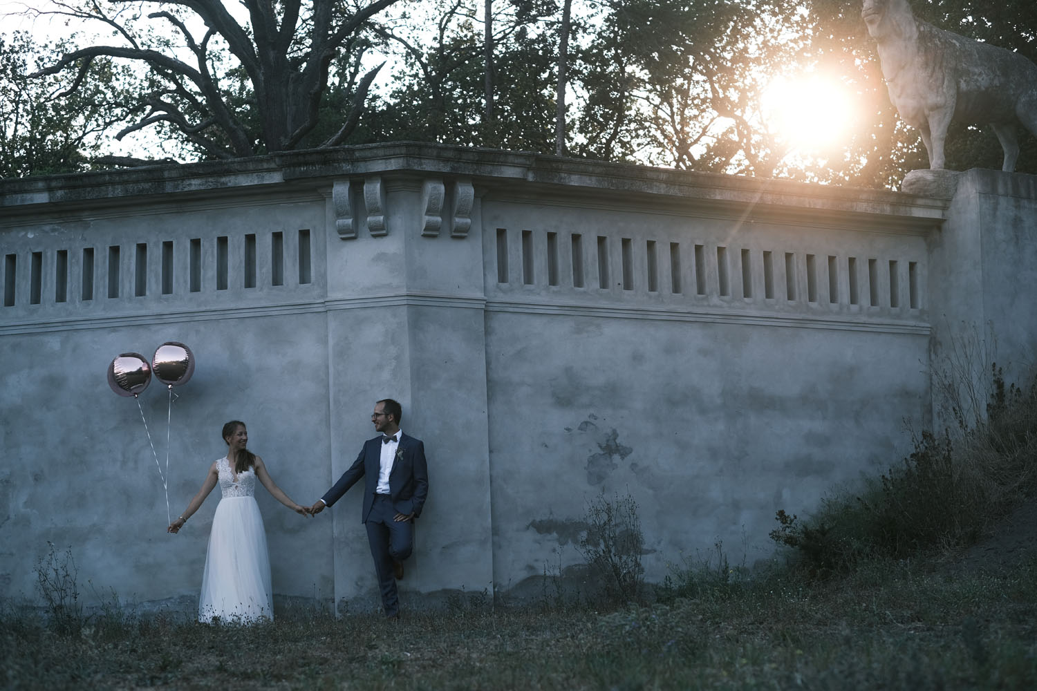
All photographs taken with “CLASSIC Neg.”. © Stefan Finger