Cracking the X-Pro3 Classic Negative Film Simulation Look on Your X-T2 (and other Fuji Cameras)

Cracking the Classic Negative look
Hardly any other company puts that much effort in creating really beautiful and useful color profiles like Fujifilm.
Fujifilm calls them “film simulations”: inspired by the look of old film stock, they try to bring some of that magic into the digital era.
In fact, Minami-San, the Fujifilm employee responsible for colors back in the film days, is still today working at Fujifilm and in charge of the digital film simulation development. You can see his story here.
One more nice thing: Fujifilm film simulation can be fine tuned ad libitum:
- read here – How to Fine Tune Your Fujifilm Film Simulation to Get the Ultimate Vintage Look
- read here – This Guy Fine Tuned his Fujifilm Film Simulation Settings Inspired by the Work of Great Film Photographers. See “Chrome Eggleston” & More
- read here – Fujifilm X-Pro3 Development Story: Classic Negative Film Simulation – Learning from Film
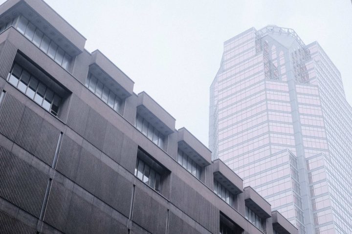
And now we come to the Fujifilm X-Pro3.
- X-Pro3 offers more in camera editing options than any other Fuji camera
- X-Pro3 offers a new film simulation called Classic Negative (inspired by Superia)
Of course we all demand for this firmware update, which should give us Classic Negative and other X-Pro3 goodness also these Fuji X/GFX cameras.
But some can’t manage their impatience, and tried to emulate the Classic Negative film simulation look, as it’s the case of Jean-Pascal Remon.
- Fujifilm X-Pro3: BHphoto, AmazonUS, Adorama, FocusCamera
How to get the Fuji Classic Negative Look to your X-Pro2/X-T2
And save yourself to buy a new camera.
by Jean-Pascal Remon – website – instagram – blog
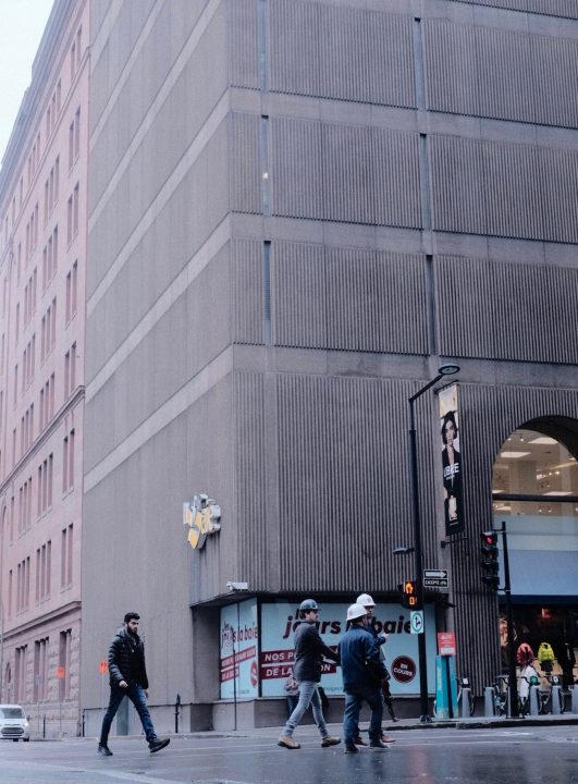
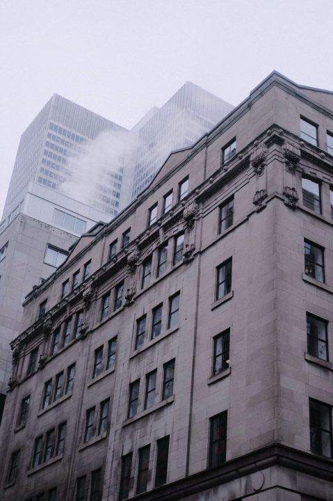
From what I’ve seen, the new Fuji Classic Negative film simulation is generous on the blue and green level, while remaining somewhat warm and keeping a low contrast.
Here is how to achieve this look.
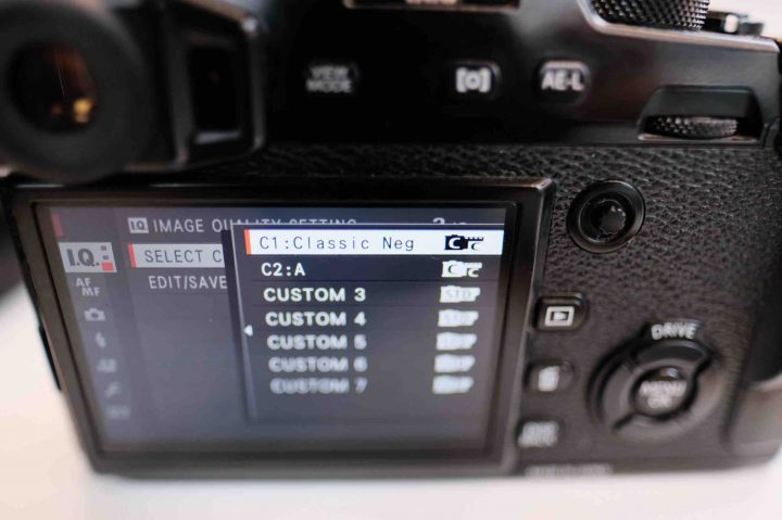
- Go in Image Quality (I.Q.) menu.
- Select 400% dynamic range.
- Select Classic Chrome film simulation;
- Grain Effect at strong, just for the heck of it (to keep the “pure photography experience”;
- White balance: Auto, R: -2 B: +4
- Highlight tone to 0;
- Shadows tone to +0 (or -1 for the EXACT look, but I find it boring, so spice it up with +2)
- Color to -1
- Sharpness to -4
- Noise Reduction to -4
- Lens modulation optimizer OFF
Make sure to save all of that into a preset!


Can you guess which one is my recipe and Fuji?
A or B
Well, I shot the first with my X-Pro3 using my recipe. So, hum, good enough.
Something I like to point out: It has a lot of character. Over-exposure offer beautiful sky and tones, while under-exposing gives character to your picture.
You don’t need to spend a $2400 CAD on a X-Pro2. Get a X-Pro2 –that is already spectacular–, cover the screen with some tape, and create a new preset in your camera. You save yourself over $1500, and that’s not small change.

You’re welcome ;)
JP
ps: Don’t buy more gear. What you have is good enough. Give your money to a charity like this one, made by a local girl from Whitehorse, Canada. Or go full boots-on-the-ground and give your time in an orphanage in Ho Chi Minh City. That is what matters at the end of the day. But if you a new camera, make sure to get something awesome, like a Nikon F5, a Fuji X-H1, or something along those things.
About the Author
Jean-Pascal Remon – website – instagram – blog. This article was also published here and shared with permission.