Fujifilm Managers Talk Film Simulations: Origins, Evolutions, Goals, Misunderstandings, Bold Classic Negative and Much More

The Japanese site dc.watch interviewed Fujifilm manager Kosuke Irie and Shinya Fujiwara.
They talk about film simulations in a lengthy, very detailed and technical way.
All in Japanese, which means we are in the hands of google translate. And sadly this does not always work out well.
I will share a summary for you down below, often just taken as google delivered it.
It will get nerdy… happy reading down below :)
- image quality consists in four elements: color, sharpness, noise and gradation. They must be in balance
- if one of these four is prominent or unsatisfactory, and the balance becomes distorted
- When it comes to creating a new film simulation, various discussions will take place. Among them, what Fujifilm thinks is particularly important is “is each color and each gradation pointing in the same direction?“
- The interviewer ask what “pointing towards the same direction” means. The manager answers in a way that google translate struggles with. But I’ll copy and paste here:
“For example, “Classic Chrome,” which is one of the film simulations, is being developed for documentaries. We control the colors so that they do not look vivid as a whole, but at the development stage, the dark red of Haz, which does not look vivid numerically, looks bright red to the human eye. It became clear after repeating the tuning test many times. Despite being tuned with a design policy of “not making the colors look vivid overall,” the dark red is pointing in a different direction. This state means that they are not facing the same direction. After setting the design intent and aim, we repeat tuning so that “each color and each gradation are facing the same direction”, and then balance it so that it is comfortable. This is the flow of film simulation development.” - the same film simulation can slightly change colors with every new image sensor and processor generation
- This is because the physical optical characteristics inevitably change not only due to differences in devices, but also due to differences in various filters such as IR cut filters and UV cut filters that exist on the image sensor unit.
- For example, you can’t reproduce exactly the same colors for example in X-T2 and X-T3
We know that film simulations are continuously developing and there are slight changes with each new processor generation. We reported for example about the changes introduced in Velvia here.
Changes, that happened also with Provia for example. The manager says (google translated).
- For example, compared to the X-T2 generation Provia, the X-T3 generation Provia has been retuned in a direction that makes the deep shadow area, such as 16 or less between 0 and 255, less likely to collapse.
And the interview goes on, talking about the origins of film simulations:
- When Fujifilm released its first digital cameras, some customers said that images looked too digital. So Fujifilm felt they need to address this
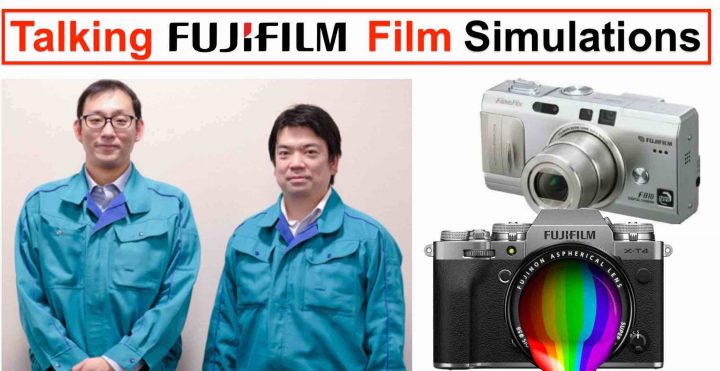
- Therefore, with the cooperation of the people involved in the development of silver halide film, Fujifilm researched how to achieve a natural and comfortable reproduction with little digital feeling. The result was the Fujifilm FinePix F810 compact digital camera released in August 2004, which was developed by defining the standard image creation installed in the F810 as “Provia.”
- FinePix S3 Pro, which appeared in 2004, is equipped with “Standard” and “F Chrome Mode”.
- FinePix S100FS in 2008 introduced the term “film simulations”, which is the name we still use today to talk about Fujifilm color profiles
An interesting question is if there are there any differences between X-Trans and Bayer cameras when it comes to film simulations.
- due to different color array, the characteristics of the spatial frequency are different
- Fujifilm has therefore to tune the colors “around that” different color array
- “but the direction we are aiming for, such as the idea and aim, especially the ideal sharpness, is the same.”
- “the GFX series has a very high MTF for compatible lenses (GF lenses), so sharpness on the image creation side is not so great. Is not … “
And it gets more nerdy when talking “grain”
- in film simulation, the noise characteristics originally possessed by the image sensor are adjusted and balanced for each film simulation.
- On the other hand, the grain effect is expected to have the effect of a technique called “dithering” that looks better in image quality by tricking the human brain by error diffusion. Therefore, the design side has the real intention that there is no “granularity” in the grain effect.
- Therefore, the grain effect is that “the dots are processed so that they can be seen as a photograph”.
- we are performing image processing to make the noise look grainy hence more “comfortable” to look at
- Fujifilm manager Irie says he thinks that human beings tend to perceive artificial and too clean images as unnatural. By adding a little noise to a homogeneous object, it can change from an artificial object to a realistic expression. The human eye itself also forms perception from noise components, so maybe there is something close to the process around it.
Film simulations: Goal and Misunderstandings
- They think Fujifilm was not able to pass the message well. In fact, film simulations do not want to emulate film itself, but just simply deliver a good image. The manager even would like to change the name “film simulations” to avoid this misunderstanding
- film simulations are not a copy of film
- Fujifilm has an image quality goal
[FR admin: in my understanding, Fujifilm says for example that Velvia film simulation is not ment to accurately copy Velvia film. What unites Velvia film and digital, is that they are both developed keeping a certain shooting scenario in mind that needs for example more popping colors]
Fujifilm says that digital film simulations can be an evolution and improvement of original film. They make the example of Astia.
- both ASTIA film and ASTIA digital are aiming for the same place. In other words, the film simulation “ASTIA” was developed to bring it closer to the “ideal ASTIA” that the development team aimed at when developing the silver halide film ASTIA
- Digitally, there are no restrictions on silver halide. […] Digital ASTIA realizes what silver salt could not do.
- In Fujifilm cameras, it’s written ASTIA/soft. But the managers think this should change. The term “soft” should be removed. It applied more to the original film rather than to digital Astia
Color Chrome Effect
- the color chrome effect is the result of repeated research and trial and error to bring it closer to the deep color expression of such films.
- color chrome effect function was developed with reference to the idea of film, and it is a multi-layer effect that intentionally suppresses the color development of the part with good color development — it is also called a multi-layer effect, but the gradation of the bright part of this is digitally. We are doing the process of constructing in a pseudo manner. By doing so, the gradation of the part that tends to be solid is clarified, and deep color reproduction can be obtained.
Memory vs Real colors
- First of all, it’s not that the color reproduction of film simulation is not faithful. After ensuring a certain degree of accuracy and colorimetricity, it is tuned for comfort and natural reproduction.
- The memory color that we think of is based on faithful color reproduction that is close to color measurement, but aims for natural reproducibility that makes the image feel “the same color” when viewed alone.
ProNeg, PROVIA, Velvia, ASTIA, Classic Chrome
- Pro Neg High and Pro Neg Standard have a different tone curve, colors are the same. The design intention of PRO Neg.Hi and PRO Neg.Std is to consider the difference in studio lighting.
- PROVIA, Velvia, and ASTIA tend to be more magenta. “In order to express the goodness of the blue sky, I tend to use magenta rather than colorimetry.”
- The interviewer says that one of his photographer friends running a photo studio said “To get a natural skin tone, add a little magenta”.
- The classic chrome skin tone has a cool image, but it’s actually shifting to warm. However, because the tone is hard and the saturation is low, it is difficult for human senses to see it.
ETERNA… or Difference between stills and video:
- The film simulation “ETERNA” was developed with reference to the images actually shot with our movie film “ETERNA”.
- In still images, the blue sky is also the main character, so Fujiffilm added a little magenta to make it look good and impressive
- but they do not want this effect in the video
- In video, the blue sky is not the main character, it is just the background. You have to suppress the sky a bit, make it less dominant
- In video, there is not only the picture, but also the movement, the sound, the dialogue, the music. All this has to be balanced, and it’s not good if the image stands out too much
- In video, colors should not “interfere” but be well balanced with the rest
Classic Negative
- The classic negative is a very special film simulation, and it is designed so that the appearance of colors changes depending on the brightness. Therefore, Fujifilm adjusted it so that it is cyan for dark tones and magenta for bright tones. It reproduces the ambiguity of film with digital, where the colors change depending on the exposure.
- Nostalgic look
- Challenges with skin tones: if you take a picture of a person’s face in one scene, there are many tones from highlight to shadow, so if you just turn the color according to the brightness, the skin tone is neutral in the halftone, but the shadow is green. The highlight becomes magenta, something like that happens in one face and it becomes a collapsed reproduction. It was really difficult to arrange such “directions for each color” and express film-like nuances within a range that does not break down.
- Classic Negative does not work with all subjects. For example “when you take a picture of a dish, it may not look very delicious“.
- It’s a “bold” film simulation, designed and launched for and with a bold camera, the Fujifilm X-Pro3
Oh boy, I wish this thing would have been published in English ;)
But if you are skilled in Japanese or want to go through all of it with google translate, check out the article at dc.watch here.
Join Our Owners Groups
- Fujifilm GFX User Group
- Fujifilm X-T User Group
- Fujifilm X-S User Group
- Fujifilm X-H User Group
- Fujifilm X-E User Group
- Fujifilm X-Pro User Group
- Fujifilm X100 line Group
Join Our Facebook Pages